
Tutorial on non linear analysis
Published:
Nonlinear time series analysis is a form of applied non-linear dynamics in chaos theory. I will present the main tools so I hope you can enjoy this tutorial!
So… non-linear time series analysis is a way to look at data, especially in time series data without using equations. Assume that we take some observations from a newly installed component. It will operate in a certain range and boundary. Over time, due to a number of reasons, these operating conditions will be violated and the component will start performing outside its acceptable range. Even though such behaviour can easily be detected using statistical properties of the component, it assumes that the system is static and is not changing over time. This is a bit of a dangerous way of looking at certain things – especially which system are dynamic in nature. I will primarily look at one technique which is more appropriate called the lagged coordinated embedding. I might touch upon a few other concepts along the way, hopefully not in a confusing way like Takens theorem and S-maps which are sequential locally weighted global linear maps which is a way to evaluate if things are causally related in a dynamical system. For starters… let’s be clear about one important notion that: Correlation does not necessarily imply causation!
This is very prevalent. You can have two variables in the data which might appear to be correlated but in reality, are independent of each other. E.g. see the image below:

Two completely different pieces of information. So even though causation is a subset of correlation; it can clearly exist in its absence. Many statisticians may like the idea of correlating information together and we all seem to be pretty good at it too. Trying to make any connections within the data often helps us simplify, understand and remember its behaviours better. The famous quote that neurons that fire together wire together! has its merits. However, look at the following image:

There seems to be no correlation between the two but we know for sure that they are casually related. The two equations are dependent on each other but, there is no way to sketch a line on both of them to reveal this just by looking at this graph. Even if we shift the graphs either way. This system is what we call non-linear and will influence each other’s feedback; which is common where you have a causal linkage but no particular correlation. To analyse this behaviour, see the following images:
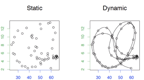
The static is two variables plotted against each other. Again, you can see that there is absolutely not correlation between them and it is not possible to do a linear fit… but when you look the dynamic image, we have connected the time points to reveal the evolution within the datum. In this chaotic behaviour, the data points are now connected to each other and they do indeed have some relationship by structure and information, just not a linear one. It should be noted that this relationship is highly dependent on the sequence of time… which makes it very important. Visualising this plot reveals the typical dynamic behaviour of such related variables. The looping here is what is called an attractor. It is a state around which the dynamic system will orbit. It should be obvious but the reason this is called an attractor is because it resembles gravity which attracts an object and makes it orbit. There are many types of shapes/topologies of these attractors and they can be n-dimensional. In most cases however we care about relatively low dimensional systems. An interesting question arises here… chaos vs noise. Is there are difference? Since our chaos is relatively low dimensional, but is complicated to predict. Noise is rather random and stochastic. In 1978, Jim Crutchfield came up with a concept of having lagged coordinated embedding – which was later proved by Takens in 1981. Some bed time reading if you are interested in the proofs but I will just capitulate here. Consider the two time series below:
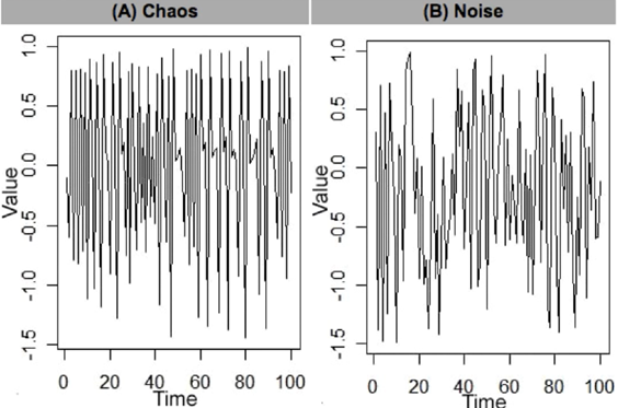
How can we conclude if there is any structure to them or is it just noise? This can be done by introducing a time delayed element and plot it against the original data. See the image below.

The x-axis the original data points and the y-axis data is the original data delayed by t. We can see that in the chaos graph a pattern emerges through the lagged coordinated embedding of the chaotic system. This is not true in the just noise plot. Also notice the vertical behaviour in the chaos plot between 0.5 and 1. These ambiguities are called singularities. These are not good because they contain information which is ambiguous. If we want predict a value around here, it will mean that it can be any of these points. A lot of work therefore is aimed at reducing these singularities as much as possible – to make them more horizontal. One way to do this is to visualise this information in 3 dimensions instead:

Aha! what we can see now is that we are able to isolate all points across the manifold and the system becomes highly predictable. We can keep adding more and more dimensions, but research shows that add more dimensions can dilutes the information which will make the predictions incorrect. The optimum embedding dimension which has the maximum predictability can be calculated using the Whitney embedding theorem i.e. n<E<2n+1, where n is the original data dimension and E is the embedding dimension we have to calculate. This gives us a range of dimensions we will need to work with. Takens took all this information and proved that if you have a manifold, you can reconstruct the shadow version of the data. Consider the 1-d data which is then lagged by t. This delayed embedded manifold can be used to project this data in a phase space, where the reconstruction preserves the mathematical topology of the system:

Let’s look at an example with some real data. We have three data variables:
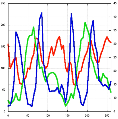
I can project them into phase space to reveal its trajectory:

I can also repeat this by only using only one variable and project the manifold in phase space:

If we compare these three individual manifolds, we can see that the number of loops and topologies are preserved. At some places they do appear to be a bit tangled up, but these can be untangled by adding more dimensions. Also, these relationships are very complex and still problematic to predict! To help with prediction we can make use of a technique called the S-map. The idea here is to be able to make a lot of small linear maps to make predictions:

But how small should these maps be? The s-map basically gives you how much emphasis you need to give to these data points that will tell me how big the segments should be e.g. more emphasis on the data points that are close to each other and less emphasis to the ones that are far away. So, the predictions will be made based only on the points that are nearby.
I will try to update this post with more information in the future.